TAB-CONTROL.ACCORDION style to a TAB-CONTROL element. When this style is active, the tab-group associated with each tab are displayed only when their corresponding tab item is selected. The behavior mimics an accordion layout: selecting an item expands its associated content while collapsing the previously active section.
   03 Tb1-accordion tab-control
      line 2 col 2 lines 17 cells size 68 cells
      accordion.
   03 tb1-accordion-page1
      tab-group Tb1-accordion tab-group-value 1.
      05 label
      . . .
   03 tb1-container-page2
      tab-group Tb1-accordion tab-group-value 2.
      05 label
      . . .
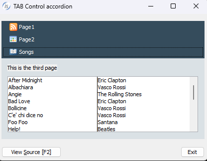
The image shows the final result with the ACCORDION style set on TAB-CONTROL. You can see the full sample program in %ISCOBOL%/sample/issamples under GUI controls, TAB-CONTROL, Accordian
Article ID: 278
Created: September 20, 2016
Last Updated: January 6, 2026
Author: Support KB Author
Online URL: https://support.veryant.com/phpkb/article.php?id=278