CHECK BOX
Refer to CHECK-BOX for details about properties, styles and events of this control.
Properties | |
(name) | Specifies the control name. This property is set automatically when the control is drawn |
additional properties | Allows the user to specify additional properties and styles. The text you write here is generated as is and may generate compile errors if not correct. |
auto-fit | TRUE... The image is scaled in order to fit the control boundaries. This is achieved through additional code generated in the Procedure Division. FALSE...The image is shown as is, if it’s too large for control boundaries, it will be truncated. |
background-color | Opens a dialog that allows the user to choose the control background color. 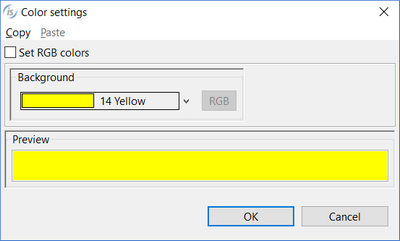 |
bitmap | Opens a dialog box that allows the user to select an image file to load into the control. It’s also possible to generate an image from a series of characters represented with a given font 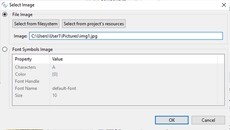 |
bitmap-disabled | Specifies the value for the Bitmap-Disabled property |
bitmap-disabled-selected | Specifies the value for the Bitmap-Disabled-Selected property |
bitmap-frame | NONE... Neither Framed nor Unframed are generated FRAMED...The Framed style is generated UNFRAMED...The Unframed style is generated |
bitmap-number | Specifies the value for the Bitmap-Number property |
bitmap-pressed | Specifies the value for the Bitmap-Pressed property |
bitmap-rollover | Specifies the value for the Bitmap-Rollover property |
bitmap-rollover-selected | Specifies the value for the Bitmap-Rollover-Selected property |
bitmap-selected | Specifies the value for the Bitmap-Selected property |
bitmap-square | TRUE...The Square style is generated FALSE...The Square style is not generated |
bitmap-width | Specifies the value for the Bitmap-Width property |
color | Opens a dialog that allows the user to choose the control color. 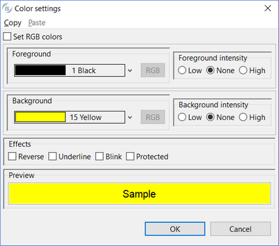 |
column | Specifies the X coordinate of the control as expressed in cells. This property is set automatically when the control is drawn. |
column pixels | Specifies the X coordinate of the control as expressed in pixels. This property is set automatically when the control is drawn. |
css-base-style-name css-style-name | Specify the CSS style associated with the control. It works only in a WebDirect environment. See Customize the WebDirect Layout using CSS for more information. |
custom-data | Specifies the value for the Custom-Data property. |
disabled-background-color | Opens a dialog that allows the user to choose the control background color when disabled.  |
disabled-color | Opens a dialog that allows the user to choose the control color when disabled.  |
disabled-foreground-color | Opens a dialog that allows the user to choose the control foreground color when disabled. 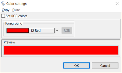 |
destroy type | AUTOMATIC...neither the Temporary nor Permanent styles are generated TEMPORARY...Temporary style is generated PERMANENT...Permanent style is generated |
enabled | NONE...Enabled property is not generated TRUE... Enabled=1 is generated FALSE...Enabeld=0 is generated |
event list | Opens a dialog that allows you to choose which events must be added to the event list of this control. 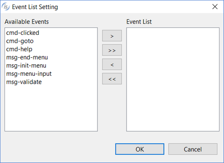 |
exception-value | Specifies the value for the Exception-Value property |
exclude event list | NONE... The Exclude-Event-List property is not generated. 0... Exclude-Event-List=0 is generated. 1... Exclude-Event-List=1 is generated. |
flat | TRUE...The Flat style is generated FALSE...The Flat style is not generated |
font | Opens a dialog that allows the user to choose the control font. 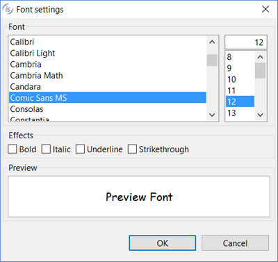 |
foreground-color | Opens a dialog that allows the user to choose the control foreground color.  |
height-in-cells | TRUE...The Height-In-Cells style is generated FALSE... The Height-In-Cells style is not generated |
help-id | Specifies the control Help-id. |
hint | Specifies the value for the Hint property. |
id | Specifies the control id. This property is set automatically when the control is drawn. |
key | Specifies the value for the Key property. |
layout-data | Opens a dialog that allows the user to choose the control resize rules. 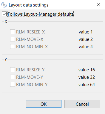 If the option "Follows Layout-Manager defaults" is checked, the Layout-Data property is not generated. |
left-text | TRUE...The Left-Text style is generated FALSE...The Left-Text style is not generated |
left-text-alignment | LEFT...Generates Left-Text-Alignment=1 RIGHT...Generates Left-Text-Alignment=0 |
line | Specifies the Y coordinate of the control as expressed in cells. This property is set automatically when the control is drawn |
line pixels | Specifies the Y coordinate of the control as expressed in pixels. This property is set automatically when the control is drawn |
lines | Specifies the control height as expressed in cells. This property is set automatically when the control is drawn |
lines pixels | Specifies the control height as expressed in pixels. This property is set automatically when the control is drawn |
lines unit | DEFAULT... Either CELLS or nothing is generated after the Lines value depending on the window’s “cell” property setting None... Neither CELLS nor PIXELS are generated after the Lines value CELLS... CELLS is generated after the Lines value PIXELS... PIXELS is generated after the Lines value |
lock | TRUE...Locks the control on the Screen Designer so that you cannot move it anymore by dragging it with the mouse. FALSE...You can move the control on the Screen Designer by dragging it with the mouse |
max-height | Specifies the control maximum height as expressed in cells |
max-width | Specifies the control maximum width as expressed in cells |
min-height | Specifies the control minimum height as expressed in cells |
min-width | Specifies the control minimum width as expressed in cells |
multiline | TRUE...The Multiline style is generated FALSE...The Multiline style is not generated |
no-tab | TRUE...The No-Tab style is generated FALSE...The No-Tab style is not generated |
notify | TRUE...The Notify style is generated FALSE...The Notify style is not generated |
notify-mouse | TRUE...The Notify-Mouse style is generated FALSE...The Notify-Mouse style is not generated |
pop up menu | Associates a pop-up menu with the control. The menu must have been drawn on the same screen. |
rollover-background-color | Opens a dialog that allows the user to choose the control background color on mouseover.  |
rollover-color | Opens a dialog that allows the user to choose the control color on mouseover.  |
rollover-foreground-color | Opens a dialog that allows the user to choose the control foreground color on mouseover.  |
self-act | TRUE...The Self-Act style is generated FALSE...The Self-Act style is not generated |
size | Specifies the control width as expressed in cells. This property is set automatically when the control is drawn |
size pixels | Specifies the control width as expressed in pixels. This property is set automatically when the control is drawn |
size unit | DEFAULT... Either CELLS or nothing is generated after the Size value depending on the window’s “cell” property setting None... Neither CELLS nor PIXELS are generated after the Size value CELLS... CELLS is generated after the Size value PIXELS... PIXELS is generated after the Size value |
tab order | Sets the ordinal position of the control in the Screen Section. This property is set automatically when the control is drawn |
termination-value | Specifies the value for the Termination-Value property |
title | Specifies the value for the Title property |
title-position | 0...NONE 1...LEFT 2...RIGHT 3...TOP 4...BOTTOM 5...CENTER |
transparent | TRUE...The Transparent style is generated FALSE...The Transparent style is not generated |
value | Specifies the value for the Value property |
visible | NONE...Visible property is not generated TRUE... Visible=1 is generated FALSE...Visible=0 is generated |
vtop | TRUE...The Vtop style is generated FALSE...The Vtop style is not generated |
width-in-cells | TRUE...The Width-In-Cells style is generated FALSE... The Width-In-Cells style is not generated |
Events | |
cmd-clicked event | Allows the user to create a paragraph to handle the CMD-CLICKED event in the Procedure Division |
cmd-goto event | Allows the user to create a paragraph to handle the CMD-GOTO event in the Procedure Division |
cmd-help event | Allows the user to create a paragraph to handle the CMD-HELP event in the Procedure Division |
msg-end-menu event | Allows the user to create a paragraph to handle the MSG-END-MENU event in the Procedure Division |
msg-init-menu event | Allows the user to create a paragraph to handle the MSG-INIT-MENU event in the Procedure Division |
msg-menu-input event | Allows the user to create a paragraph to handle the MSG-MENU-INPUT event in the Procedure Division |
msg-mouse-enter event | Allows the user to create a paragraph to handle the MSG-MOUSE-ENTER event in the Procedure Division |
msg-mouse-exit event | Allows the user to create a paragraph to handle the MSG-MOUSE-EXIT event in the Procedure Division |
msg-validate event | Allows the user to create a paragraph to handle the MSG-VALIDATE event in the Procedure Division |
other event | Allows the user to create a custom paragraph |
Exceptions | |
cmd-clicked exception | Allows the user to create a paragraph to handle the CMD-CLICKED event when the Accept terminates with crt status = 96. This is an alternative to the event procedures described above |
cmd-goto exception | Allows the user to create a paragraph to handle the CMD-GOTO event when the Accept terminates with crt status = 96. This is an alternative to the event procedures described above |
cmd-help exception | Allows the user to create a paragraph to handle the CMD-HELP event when the Accept terminates with crt status = 96. This is an alternative to the event procedures described above |
other exception | Allows the user to create a custom paragraph |
Procedures | |
After procedure | Allows the user to create a paragraph to handle the control AFTER PROCEDURE |
After procedure thru | Allows the user to optionally specify a THRU paragraph for the AFTER PROCEDURE. |
Before procedure | Allows the user to create a paragraph to handle the control BEFORE PROCEDURE |
Before procedure thru | Allows the user to optionally specify a THRU paragraph for the BEFORE PROCEDURE. |
Event procedure | Allows the user to create a paragraph to handle the control EVENT PROCEDURE |
Exception procedure | Allows the user to create a paragraph to handle the control EXCETPION PROCEDURE |
Variables | |
bitmap-disabled variable | Numeric variable that hosts the value for the Bitmap-Disabled property |
bitmap-disabled-selected variable | Numeric variable that hosts the value for the Bitmap-Disabled-Selected property |
bitmap-number variable | Numeric variable that hosts the value for the Bitmap-Number property |
bitmap-pressed value | Numeric variable that hosts the value for the Bitmap-Pressed property |
bitmap-rollover-selected variable | Numeric variable that hosts the value for the Bitmap-Rollover-Selected property |
bitmap-rollover variable | Numeric variable that hosts the value for the Bitmap-Rollover property |
bitmap-selected variable | Numeric variable that hosts the value for the Bitmap-Selected property |
bitmap-width variable | Numeric variable that hosts the value for the Bitmap-Width property |
color variable | Numeric variable that hosts the color value |
column variable | Numeric variable that hosts the column value |
css-style-name variable | Alphanumeric variable that hosts the css style associated with the control. It works only in a WebDirect environment. |
disabled-background-color variable | Numeric variable that hosts the value for the Disabled-Background-Color property |
disabled-color variable | Numeric variable that hosts the value for the Disabled-Color property |
disabled-foreground-color variable | Numeric variable that hosts the value for the Disabled-Foreground-Color property |
enabled variable | Numeric variable that hosts the enabled state |
exception-value variable | Numeric variable that hosts the value for the Exception-Value property |
help-id variable | Numeric variable that hosts the help id |
hint variable | Alphanumeric variable that hosts the value for the Hint property |
id variable | Numeric variable that hosts the control id |
key variable | Alphanumeric variable that hosts the value for the Key property |
layout-data variable | Numeric variable that hosts the control resize rules |
lines variable | Numeric variable that hosts the lines value |
line variable | Numeric variable that hosts the line value |
max-height variable | Numeric variable that hosts the maximum height |
max-width variable | Numeric variable that hosts the maximum width |
min-height variable | Numeric variable that hosts the minimum height |
min-width variable | Numeric variable that hosts the minimum width |
rollover-background-color variable | Numeric variable that hosts the value for the Rollover-Background-Color property |
rollover-color variable | Numeric variable that hosts the value for the Rollover-Color property |
rollover-foreground-color variable | Numeric variable that hosts the value for the Rollover-Foreground-Color property |
size variable | Numeric variable that hosts the size value |
title variable | Numeric variable that hosts the value for the Title property |
title-position variable | Numeric variable that hosts the value for the Title-Position property |
value variable | Numeric variable that hosts the value for the Value property |
visible variable | Numeric variable that hosts the visible state |