LIST BOX CHECKED
Refer to LIST-BOX for details about properties, styles and events of this control.
Properties | |
(name) | Specifies the control name. This property is set automatically when the control is drawn |
additional properties | Allows the user to specify additional properties and styles. The text you write here is generated as is and may generate compile errors if not correct. |
background-bitmap | Opens a dialog box that allows the user to select an image file to load into the control.  |
background-bitmap-scale | Allows the user to choose if the background-bitmap must be scaled to fit the control area. The Background-Bitmap-Scale property is generated according to this choice. |
background-color | Opens a dialog that allows the user to choose the control background color. 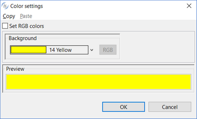 |
border | Allows the user to set one of the following three styles: 3-D BOXED NO-BOX |
border color | Opens a dialog that allows the user to choose the control border color. 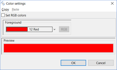 |
border width | Opens a dialog that allows the user to choose the control border width. 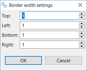 |
case | None....Neither the Upper nor Lower styles are generated UPPER....Upper style is generated LOWER...Lower style is generated |
color | Opens a dialog that allows the user to choose the control color. 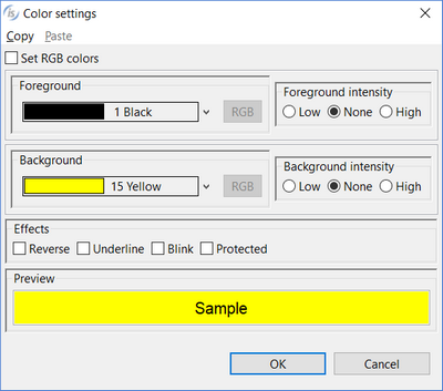 |
column | Specifies the X coordinate of the control as expressed in cells. This property is set automatically when the control is drawn. |
column pixels | Specifies the X coordinate of the control as expressed in pixels. This property is set automatically when the control is drawn. |
css-base-style-name css-style-name | Specify the CSS style associated with the control. It works only in a WebDirect environment. See Customize the WebDirect Layout using CSS for more information. |
custom-data | Specifies the value for the Custom-Data property. |
destroy type | AUTOMATIC...neither the Temporary nor Permanent styles are generated TEMPORARY...Temporary style is generated PERMANENT...Permanent style is generated |
enabled | NONE...Enabled property is not generated TRUE... Enabled=1 is generated FALSE...Enabled=0 is generated |
event list | Opens a dialog that allows you to choose which events must be added to the event list of this control. 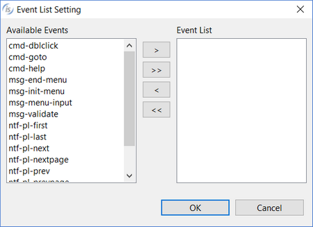 |
exception-value | Specifies the value for the Exception-Value property |
exclude event list | NONE... The Exclude-Event-List property is not generated. 0... Exclude-Event-List=0 is generated. 1... Exclude-Event-List=1 is generated. |
export file format | Specifies the value for the Export-File-Format property. |
export file name | Specifies the value for the Export-File-Name property. |
font | Opens a dialog that allows the user to choose the control font. 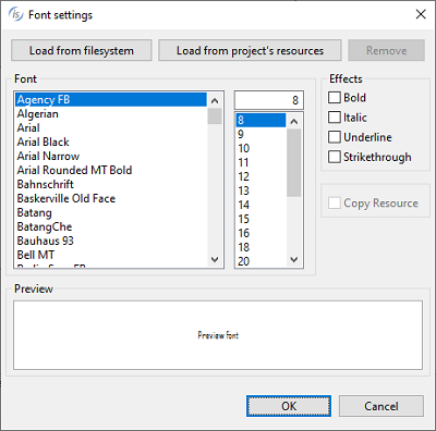 The dialog lists the fonts installed in the system and allows you to load new fonts from disc files. Fonts loaded from disc are added to the list with an asterisk before their name. When one of these fonts is selected the Copy Resource option is enabled and can be activated. Activate the option to include the font disc file in the compiled class or be sure to distribute this file along with your application. |
foreground-color | Opens a dialog that allows the user to choose the control foreground color.  |
gradient-color-1 | Opens a dialog that allows the user to choose the window gradient start color.  |
gradient-color-2 | Opens a dialog that allows the user to choose the window gradient end color.  |
gradient-orientation | Specifies the gradient orientation. Possible values are: None 0: NORTH-TO-SOUTH 1: NORTHEAST-TO-SOUTHWEST 2: EAST-TO-WEST 3: SOUTHEAST-TO-NORTHWEST 4: SOUTH-TO-NORTH 5: SOUTHWEST-TO-NORTHEAST 6: WEST-TO-EAST 7: NORTHWEST-TO-SOUTHEAST |
height-in-cells | TRUE...The Height-In-Cells style is generated FALSE... The Height-In-Cells style is not generated |
help-id | Specifies the control Help-id. |
hint | Specifies the value for the Hint property |
id | Specifies the control id. This property is set automatically when the control is drawn. |
item-to-add | Opens a dialog that allows the user to set text and icons for each single item 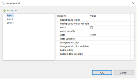 |
key | Specifies the value for the Key property. |
layout-data | Opens a dialog that allows the user to choose the control resize rules. 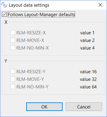 If the option "Follows Layout-Manager defaults" is checked, the Layout-Data property is not generated. |
line | Specifies the Y coordinate of the control as expressed in cells. This property is set automatically when the control is drawn |
line pixels | Specifies the Y coordinate of the control as expressed in pixels. This property is set automatically when the control is drawn |
lines | Specifies the control height as expressed in cells. This property is set automatically when the control is drawn |
lines pixels | Specifies the control height as expressed in pixels. This property is set automatically when the control is drawn |
lines unit | DEFAULT... Either CELLS or nothing is generated after the Lines value depending on the window’s “cell” property setting None... Neither CELLS nor PIXELS are generated after the Lines value CELLS... CELLS is generated after the Lines value PIXELS... PIXELS is generated after the Lines value |
lock | TRUE...Locks the control on the Screen Designer so that you cannot move it anymore by dragging it with the mouse. FALSE...You can move the control on the Screen Designer by dragging it with the mouse |
mass-update | TRUE... Mass-Update=1 is generated FALSE... Mass-Update property is not generated |
max-height | Specifies the control maximum height as expressed in cells |
max-width | Specifies the control maximum width as expressed in cells |
min-height | Specifies the control minimum height as expressed in cells |
min-width | Specifies the control minimum width as expressed in cells |
no-tab | TRUE...The No-Tab style is generated FALSE...The No-Tab style is not generated |
notify dblclick | TRUE...The Notify-Dblclick style is generated FALSE...The Notify-Dblclick style is not generated |
notify-mouse | TRUE...The Notify-Mouse style is generated FALSE...The Notify-Mouse style is not generated |
notify selchange | TRUE...The Notify-Selchange style is generated FALSE...The Notify-Selchange style is not generated |
pop up menu | Associates a pop-up menu with the control. The menu must have been drawn on the same screen. |
selection index | Specifies the value for the Selection-Index property |
selection mode | SINGLE-SELECTION...Shows radio buttons before items. Only one item can be selected. MULTIPLE-SELECTION...Shows check boxes before items. Multiple items can be selected. |
size | Specifies the control width as expressed in cells. This property is set automatically when the control is drawn |
size pixels | Specifies the control width as expressed in pixels. This property is set automatically when the control is drawn |
tab order | Sets the ordinal position of the control in the Screen Section. This property is set automatically when the control is drawn |
termination-value | Specifies the value for the Termination-Value property |
unsorted | TRUE... The Unsorted style is generated FALSE... The Unsorted style is not generated |
value | Specifies the value for the Value property |
visible | NONE...Visible property is not generated TRUE... Visible=1 is generated FALSE...Visible=0 is generated |
width-in-cells | TRUE...The Width-In-Cells style is generated FALSE... The Width-In-Cells style is not generated |
Events | |
cmd-goto event | Allows the user to create a paragraph to handle the CMD-GOTO event in the Procedure Division |
cmd-help event | Allows the user to create a paragraph to handle the CMD-HELP event in the Procedure Division |
msg-end-menu event | Allows the user to create a paragraph to handle the MSG-END-MENU event in the Procedure Division |
msg-init-menu event | Allows the user to create a paragraph to handle the MSG-INIT-MENU event in the Procedure Division |
msg-menu-input event | Allows the user to create a paragraph to handle the MSG-MENU-INPUT event in the Procedure Division |
msg-mouse-enter event | Allows the user to create a paragraph to handle the MSG-MOUSE-ENTER event in the Procedure Division |
msg-mouse-exit event | Allows the user to create a paragraph to handle the MSG-MOUSE-EXIT event in the Procedure Division |
msg-validate event | Allows the user to create a paragraph to handle the MSG-VALIDATE event in the Procedure Division |
ntf-selchange-event | Allows the user to create a paragraph to handle the NTF-SELCHANGE event in the Procedure Division |
other event | Allows the user to create a custom paragraph |
Exceptions | |
cmd-goto exception | Allows the user to create a paragraph to handle the CMD-GOTO event when the Accept terminates with crt status = 96. This is an alternative to the event procedures described above |
cmd-help exception | Allows the user to create a paragraph to handle the CMD-HELP event when the Accept terminates with crt status = 96. This is an alternative to the event procedures described above |
ntf-selchange exception | Allows the user to create a paragraph to handle the NTF-SELCHANGE event when the Accept terminates with crt status = 96. This is an alternative to the event procedures described above |
other exception | Allows the user to create a custom paragraph |
Procedures | |
After procedure | Allows the user to create a paragraph to handle the control AFTER PROCEDURE |
After procedure thru | Allows the user to optionally specify a THRU paragraph for the AFTER PROCEDURE. |
Before procedure | Allows the user to create a paragraph to handle the control BEFORE PROCEDURE |
Before procedure thru | Allows the user to optionally specify a THRU paragraph for the BEFORE PROCEDURE. |
Event procedure | Allows the user to create a paragraph to handle the control EVENT PROCEDURE |
Exception procedure | Allows the user to create a paragraph to handle the control EXCETPION PROCEDURE |
Link To | Associates a paragraph with the control that will be executed when the control is double clicked |
Variables | |
background-bitmap-scale variable | Numeric variable that hosts the value for the Background-Bitmap-Scale property |
background-color variable | Numeric variable that hosts the value for the Background-Color property. |
border color variable | Numeric variable that hosts the value for the Border-Color property. |
border width variable | Numeric variable that hosts the value for the Border-Width property. |
color variable | Numeric variable that hosts the color value |
column variable | Numeric variable that hosts the column value |
css-style-name variable | Alphanumeric variable that hosts the css style associated with the control. It works only in a WebDirect environment. |
enabled variable | Numeric variable that hosts the enabled state |
exception-value variable | Numeric variable that hosts the value for the Exception-Value property |
export file format variable | Alphanumeric variable that hosts the value for the Export-File-Format property |
export file name variable | Alphanumeric variable that hosts the value for the Export-File-Name property |
foreground-color variable | Numeric variable that hosts the value for the Foreground-Color property. |
help-id variable | Numeric variable that hosts the help id |
hint variable | Alphanumeric variable that hosts the value for the Hint property |
id variable | Numeric variable that hosts the control id |
item-to-add variable | Alphanumeric variable that hosts the value for the Item-To-Add property |
key variable | Alphanumeric variable that hosts the value for the Key property |
layout-data variable | Numeric variable that hosts the control resize rules |
lines variable | Numeric variable that hosts the lines value |
line variable | Numeric variable that hosts the line value |
max-height variable | Numeric variable that hosts the maximum height |
max-width variable | Numeric variable that hosts the maximum width |
min-height variable | Numeric variable that hosts the minimum height |
min-width variable | Numeric variable that hosts the minimum width |
size variable | Numeric variable that hosts the size value |
value container | occurs item that hosts control items |
value variable | Alphanumeric variable that hosts the value for the Value property |
visible variable | Numeric variable that hosts the visible state |