TOOL BAR
Refer to TOOL-BAR for details about properties, styles and events of this control.
Properties | |
(name) | Specifies the control name. This property is set automatically when the control is drawn |
cell | TRUE... The Cell-Width and Cell-Height properties are generated and Lines is measured in cells. FALSE... The Cell-Width and Cell-Height properties are not generated and Lines is not measured in cells. |
cell-height | Specifies the value for the Cell-Height property |
call-width | Specifies the value for the Cell-Width property |
background-bitmap | Opens a dialog box that allows the user to select an image file to load into the control.  |
background-bitmap-scale | Allows the user to choose if the background-bitmap must be scaled to fit the control area. The Background-Bitmap-Scale property is generated according to this choice. |
background-color | Opens a dialog that allows the user to choose the control background color. 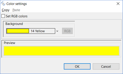 |
color | Opens a dialog that allows the user to choose the control color. 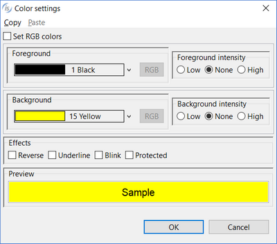 The dialog lists the fonts installed in the system and allows you to load new fonts from disc files. Fonts loaded from disc are added to the list with an asterisk before their name. When one of these fonts is selected the Copy Resource option is enabled and can be activated. Activate the option to include the font disc file in the compiled class or be sure to distribute this file along with your application. |
control font | Opens a dialog that allows the user to choose the control font. 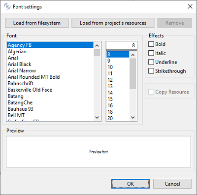 The dialog lists the fonts installed in the system and allows you to load new fonts from disc files. Fonts loaded from disc are added to the list with an asterisk before their name. When one of these fonts is selected the Copy Resource option is enabled and can be activated. Activate the option to include the font disc file in the compiled class or be sure to distribute this file along with your application. |
custom-data | Specifies the value for the Custom-Data property. |
foreground-color | Opens a dialog that allows the user to choose the control foreground color. 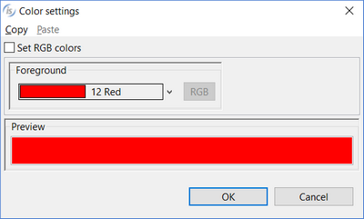 |
gradient-color-1 | Opens a dialog that allows the user to choose the window gradient start color.  |
gradient-color-2 | Opens a dialog that allows the user to choose the window gradient end color.  |
gradient-orientation | Specifies the gradient orientation. Possible values are: None 0: NORTH-TO-SOUTH 1: NORTHEAST-TO-SOUTHWEST 2: EAST-TO-WEST 3: SOUTHEAST-TO-NORTHWEST 4: SOUTH-TO-NORTH 5: SOUTHWEST-TO-NORTHEAST 6: WEST-TO-EAST 7: NORTHWEST-TO-SOUTHEAST |
layout manager | Opens a dialog that allows you to choose which layout manager should be associated to the toolbar. When either LM-SCALE or LM-RESPONSIVE is selected, it’s possible to specify the configuration string. In this dialog you also associate a handle to the layout manager. 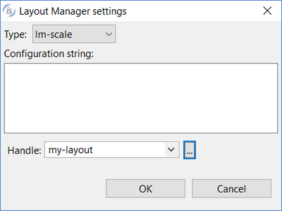 |
lines | Specifies the control height as expressed in cells. This property is set automatically when the control is drawn |
lines pixels | Specifies the control height as expressed in pixels. This property is set automatically when the control is drawn |
lines unit | DEFAULT... Either CELLS or nothing is generated after the Lines value depending on the window’s “cell” property setting None... Neither CELLS nor PIXELS are generated after the Lines value CELLS... CELLS is generated after the Lines value PIXELS... PIXELS is generated after the Lines value |
lock | TRUE...Locks the control on the Screen Designer so that you cannot move it anymore by dragging it with the mouse. FALSE...You can move the control on the Screen Designer by dragging it with the mouse |
moveable | TRUE... The Moveable style is generated FALSE... The Moveable style is not generated |
multiline | TRUE... The Multiline style is generated FALSE... The Multiline style is not generated |
pop up menu | Associates a pop-up menu with the control. The menu must have been drawn on the same screen. |
tab order | Sets the ordinal position of the control in the Screen Section. This property is set automatically when the control is drawn |
width-in-cells | TRUE...The Width-In-Cells style is generated FALSE... The Width-In-Cells style is not generated |
Events | |
No Events available. | |
Exceptions | |
No Exceptions available. | |
Procedures | |
No Procedures available. | |
Variables | |
background-color variable | Numeric variable that hosts the value for the Background-Color property |
color variable | Numeric variable that hosts the value for the Color property |
custom-data variable | Alphanumeric variable that hosts the value for the Custom-Data property |
foreground-color variable | Numeric variable that hosts the value for the Foreground-Color property |
gradient-color-1 variable | Numeric variable that hosts the value for the Gradient-Color-1 property |
gradient-color-2 variable | Numeric variable that hosts the value for the Gradient-Color-2 property |
gradient-orientation variable | Numeric variable that hosts the value for the Gradient-Orientation property |
toolbar-handle | Numeric variable that hosts the control handle |